Leader
| Toolbar | Menu |
|---|---|
|
|
Drafting Leader |
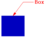
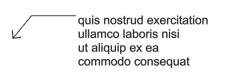
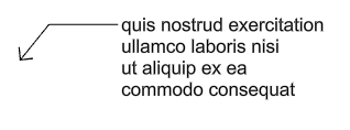
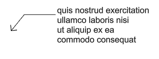
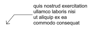
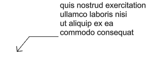
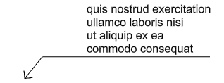
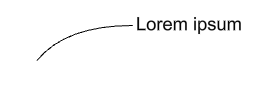
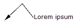
The Leader command draws an annotation leader with arrowhead and attached text.
 User's Guide - Architectural Drawings
Steps
Add special symbols in the scriptable command, -Leader
Text containing spaces, to be entered at the Rhino command line, must be enclosed in double-quotes. In addition, some rich text characters cannot be input directly at the Rhino command line; they need to be enclosed in double-quotes or escaped using a single backslash in order to be correctly interpreted. For example:
|
Symbol |
Input |
Output |
|
' (Single quote) |
"'xyz'" |
'xyz' |
|
" (Double quote) |
""xyz"" |
"xyz" |
|
! (Exclamation mark at beginning) |
"!xyz" |
!xyz |
|
\ (Backslash) |
"\\xyz\\" |
\xyz\ |
|
{ and } (Curly brackets) |
\{xyz\} |
{xyz} |
 Leader properties
Text
Style
The used annotation style.
Style menu
Lists the annotation styles available in the model. If an annotation has any settings in its properties different from its style, a menu behind the style name appears.
Remove overrides
Resets all the changed settings to the style defaults.
Update <Style> to match
Applies the changed settings to the annotation style.
Save as new style
Uses the settings in the properties to create a new style.
Edit Style...
Edits the Annotations style used by the selected annotation object.
Height
The text height.
Mask
Surrounds text with an opaque color.
None
Turn off mask.

Background
Sets the mask color to the viewport background color.

Solid Color
Selects the mask color using the Select Color dialog box.
Mask Color
When Mask is set to Solid Color, click to change the color.
Mask margins
The width of the blank area around the text.
Model space scale
The display size is a product of the component's size (like arrow size or text height) and the Model space scale value.
Normally this is the inverse of the print scale. The text height, extension line extension, extension line offset distance, and arrow length are multiplied by this number.
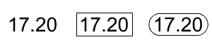
Frame around text
Sets the shape enclosing the dimension text to No frame (left), Rectangular frame (middle), or Capsule frame (right). The Mask margins setting controls the distance between the text and shape.
Font
The text appearance.
-
Click to open the drop-down list, and type the initial letter of a font to find the font quickly.
-
Click the font control twice and scroll the mouse wheel to select a font with preview.

-
If a font used by an annotation is missing on the current system:
You will be prompted when the model is opened.
Enable the "Don't show this message again" checkbox in the warning dialog box to stop detecting missing fonts.
To re-enable missing font detection, enable Rhino.Warnings.MissingFontWarning in Rhino Options > Advanced.
The annotation displays with a substitute font in viewports.
The missing font is listed with "(not installed)" in the font list.
 Left align text
 Center align text
 Right align text
Top
Middle of first line
Bottom of first line
Middle
Middle of last line

Bottom
Underlined
B
Sets the font style to bold.
I
Sets the font style to italic.
U
Sets the font style to underlined.
 Text Field
Text fields are formulas that are evaluated while Rhino is running and the result is displayed in the text. All text fields are in the syntax of %<field and options>%. When a formula cannot be evaluated an error string of #### is displayed.
- If a text field displays a long text string, such as a long file path, you can turn on control points of the text and move the right text point to wrap the text string.
- Text fields support basic arithmetic operations.
To double an area, add *2 behind the close parenthesis as:
%<Area("d90815b8...80c59a")*2>%
To multiply two text fields, use:
%<CurveLength("07c73fde...8a5c7b")*CurveLength("296ed593...0472e0")>% - When a text field is copied with its referenced object, the copied text field will reference the copied object.
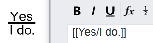
 Toggle stacking brackets
The toggle stacking brackets button is a shortcut to add or remove [[...]] around text selected in the edit box. Stacking brackets will make the text between them stack, so that [[1/2]] will display as a stacked fraction.
Syntax of fraction stacking
The fraction stacking is designed to parse two text strings divided by a forward slash within double square brackets at the start and the end. The syntax is [[x/y]] where x is on the top and y is at the bottom. For example, [[Yes/I do.]] does stack like what you see below.
 Degree
Enters a degree symbol (°) into the text.
 Radius
Enters a radius symbol (R) into the text.
 Diameter
Enters a diameter symbol (Ø) into the text.
 Plus/Minus
Enters a plus/minus symbol (±) into the text.
 Exponent 2
Enters a superscript 2 (²) into the text.
 Exponent 3
Enters a superscript 3 (³) into the text.
Edit box
The text displays in the leader.
Edits the Annotations style used by the selected annotation object.
Selects an annotation to apply its properties to the current leader.
Allows placing an additional edit point to the leader curve.
Unit - Format
The unit and format of the annotation style.
Only for the leader created by DimArea or DimCurveLenth, or contains a Text Field of Area, CurveLength, or Volume.
More properties
Arrowhead
 Arrow
Arrow
 Dot
Dot
 Tick
Tick
 Short arrow
 Open arrow
 Rectangle
 Thin arrow
 Thinner arrow
User arrow
Uses a previously defined block as an arrowhead.
This option is not available when no blocks exist in the model.

To create a block to represent the arrowhead
- Draw the arrow elements.
- Create a block from the geometry.
Note
-
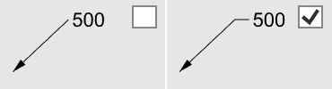
The base point of the arrowhead block determines how the arrowhead is placed on the end of a dimension line or a leader. In the illustration below:
(1) The base point of the arrowhead block is placed at the tip of the arrowhead curve. The dimension line passes the arrowhead.
(2) The base point of the arrowhead block is placed at the end of the arrowhead curve. The dimension line does not pass the arrowhead.
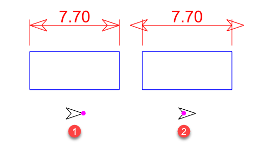
If you want the tip of the arrowhead to be accurately placed at a location, be sure to place the base point of the arrowhead block at the tip.
- Make use of the By object, By layer, and By parent features of the Block command to control the appearance of the arrow.
No arrow
No arrow is drawn.
Arrow size
The length of the arrowhead from tip to tail.

Curve type
Sets the type of curve used by the leader.
None
Only the arrowhead and text are drawn.

Polyline
A segmented polyline is drawn.

Spline
A control point curve is used as the leader line.

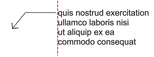
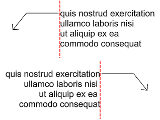
Text alignment
Horizontal
The text aligns to the construction plane x-axis.
Aligned
The text is aligned to the leader segment.

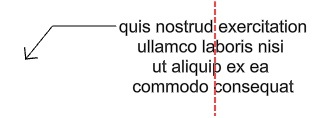
 Landing
Adds a short horizontal line between the leader line and the text.
| Toolbar | Menu |
|---|---|
|
|
|

The Arrowhead command modifies the end of a curve to an arrowhead shape.
Steps
- Pick a curve near the end where you want to place an arrowhead.