Button Editor
The Button Editor manages the appearances, images, and commands of toolbar buttons.
Appearance
Inherit appearance from tab
When selected, the button style is set in the tab.
To access toolbar tab settings
-
Right-click the toolbar tab, and then select Properties.
Image only
Displays the image only.

Text only
Displays the text only.

Both image and text
Displays both the image and the text.

Edit light mode image
Edits the image used for light mode.
-
Click the icon to open the SVG Editor dialog.
Dark mode image options
Specifies how the image is used for dark mode.
-
Click the small triangle to show the options.
Use light image for dark modes
Uses the same image for both light and dark modes.
Recolor light image for dark modes
Automatically recolors the light mode image for use in dark mode.
Use a different image
Specifies a separate image for dark mode.
-
Click the icon to edit the dark image.
Text
The text displays on the button when Text only or Both image and text is selected.
Left mouse button / Right mouse button
Tooltip
The text that appears when the mouse cursor hovers over the button.
Command
The command, macro, or script that the left or right mouse button runs.
-
Editing the macro in a button adds a new macro item to the Macro Library.
Linked toolbar
 Link
Link
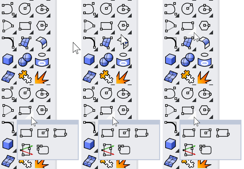
Select a toolbar that flies out from the button when you click and hold the button, or click the black triangle on the lower-right corner of the button.

 Unlink
Remove the linked toolbar from the button.
 Float to top
Makes the last used button on the linked toolbar appear as the link button on the parent toolbar.
If you normally use a specific button on a linked toolbar and rarely use the others, you probably want the one you use most to always appear on the link button. In this case, clear Float to Top.