Dimension
Leader
| Toolbar | Menu |
|---|---|
|
|
Dimension Leader |
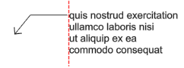
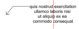
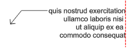
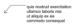
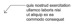
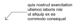
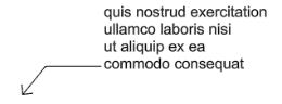
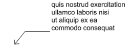
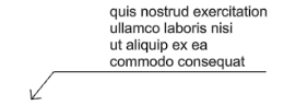
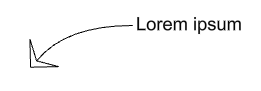
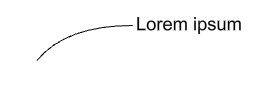
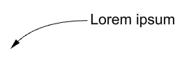
The Leader command draws an annotation leader with arrowhead and attached text.
 Leader properties
The used annotation style.
Lists the annotation styles available in the model. If an annotation has any settings in its properties different from its style, a menu behind the style name appears.
Resets all the changed settings to the style defaults.
Applies the changed settings to the annotation style.
Uses the settings in the properties to create a new style.
Edits the Annotations style used by the selected annotation object.
The text height.
Surrounds text with an opaque color.
Turn off mask.
Sets the mask color to the viewport background color.
Selects the mask color using the Select Color dialog box.

When Mask is set to Solid Color, click to change the color.
The width of the blank area around the text.
The display size is a product of the component's size (like arrow size or text height) and the Model space scale value.
Normally this is the inverse of the print scale. The text height, extension line extension, extension line offset distance, and arrow length are multiplied by this number.
The text appearance.
Click to open the drop-down list, and type the initial letter of a font to find the font quickly.
Click the font control twice and scroll the mouse wheel to select a font with preview.

If a font used by an annotation is missing on the current system:
You will be prompted when you select the annotation or edit the style.
The annotation displays with a substitute font in viewports.
The missing font is listed with "(not installed)" in the font list.
 Left align text
 Center align text
 Right align text
Sets the font style to bold.
Sets the font style to italic.
Sets the font style to underlined.
 Text Field
Text fields are formulas that are evaluated while Rhino is running and the result is displayed in the text. All text fields are in the syntax of %<field and options>%. When a formula cannot be evaluated an error string of #### is displayed.
Note
 Toggle stacking brackets
The toggle stacking brackets button is a shortcut to add or remove [[...]] around text selected in the edit box. Stacking brackets will make the text between them stack, so that [[1/2]] will display as a stacked fraction.
 Degree
Enters a degree symbol (°) into the text.
 Radius
Enters a radius symbol (R) into the text.
 Diameter
Enters a diameter symbol (Ø) into the text.
 Plus/Minus
Enters a plus/minus symbol (±) into the text.
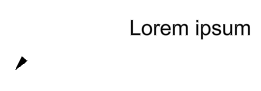
The text displays in the leader.
Edits the Annotations style used by the selected annotation object.
Selects an annotation to apply its properties to the current leader.
Allows placing an additional edit point to the leader curve.
 Arrow
Arrow  Dot
Dot  Tick
Tick  Short arrow
  Open arrow
  Rectangle
  Thin arrow
  Thinner arrow
 Uses a previously defined block as an arrowhead.
This option is not available when no blocks exist in the model.
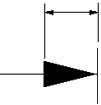
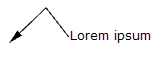
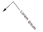
The base point of the arrowhead block determines how the arrowhead is placed on the end of a dimension line or a leader. In the illustration below:
(1) The base point of the arrowhead block is placed at the tip of the arrowhead curve. The dimension line passes the arrowhead.
(2) The base point of the arrowhead block is placed at the end of the arrowhead curve. The dimension line does not pass the arrowhead.
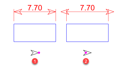
If you want the tip of the arrowhead to be accurately placed at a location, be sure to place the base point of the arrowhead block at the tip.
No arrow is drawn.
The length of the arrowhead from tip to tail.
Sets the type of curve used by the leader.
Only the arrowhead and text are drawn.
A segmented polyline is drawn.
A control point curve is used as the leader line.
The text aligns to the construction plane x-axis.
The text is aligned to the leader segment.
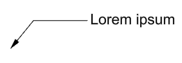
 Landing
Adds a short horizontal line between the leader line and the text.
| Toolbar | Menu |
|---|---|
|
|
|
The Arrowhead command modifies the end of a curve to an arrowhead shape.
The arrowhead size cannot be changed.
Use text and dimensions for annotation
Rhinoceros 6 © 2010-2020 Robert McNeel & Associates. 11-Nov-2020
